


Client
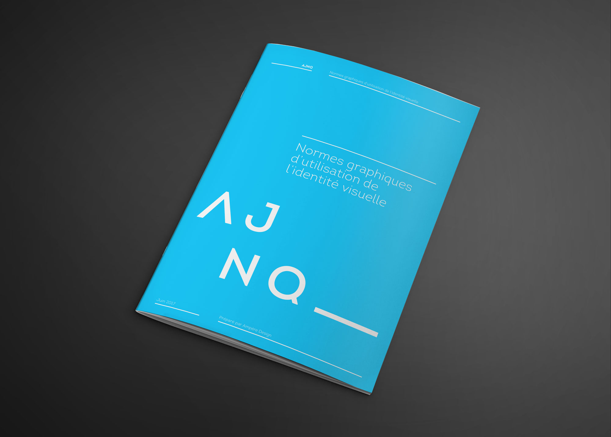
Association des Jeunes Notaires du Québec
Discipline
Visual identity
Graphic design
Date
2017
Description
L’Association des Jeunes Notaires du Québec, a growing community of over 1000 members, pursues the defense, the promotion and the representation of young Québec notaries. Open to notaries with less than 10 years of practice, the AJNQ came to us seeking a visual identity program reflecting both the professional aspect of the industry (through its sober character and a blue color so deeply associated with the profession), while seeking to distance itself enough to project a more youthful and contemporary side.
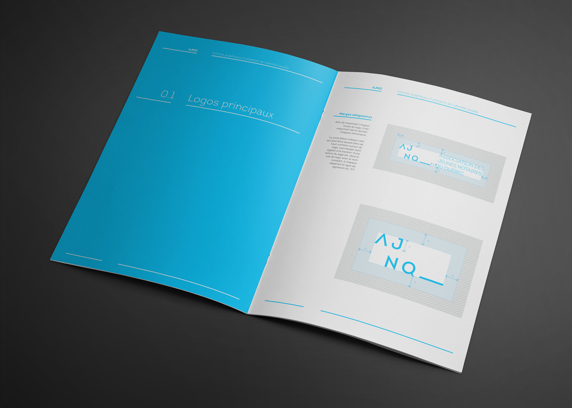
The choice of sans-serif typography and a more striking, brighter shade of blue than the usual notarial blue, as well as the conscious decision to feature very few graphic elements in order to create an open, sparse identity, create a solid and coherent set on which is set the main concept of this programme : the signature.
The first criterion from which this concept emerges is the decision to create a cohesive link with the notarial profession without having recourse to the usual industry tropes (seal, stamps, fountain pen). The second criterion was to embed this symbol in a minimal and clean style, contributing to the general contemporary feel of the identity. The idea of the line on which both notary and client must write their signature organically emerged as the key concept of this project, filling both criteria and giving this project its, uh, signature!